First Photoshop Assignment
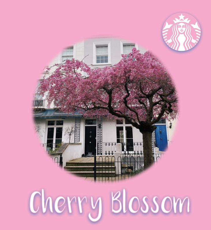
I chose the picture of the cherry blossom tree because it looks really pretty. I wanted to use a pink background to match the tree. I picked the text to be white so it matches with the white building behind the tree. I liked the blue shadow behind the text and the logo because it makes the blue door in the picture stand out. I wanted to make the logo and the text match. I picked the Starbucks logo because Starbucks used to have a cherry blossom drink.
|
|
Shoe Advertisement Inspiration
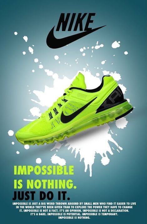
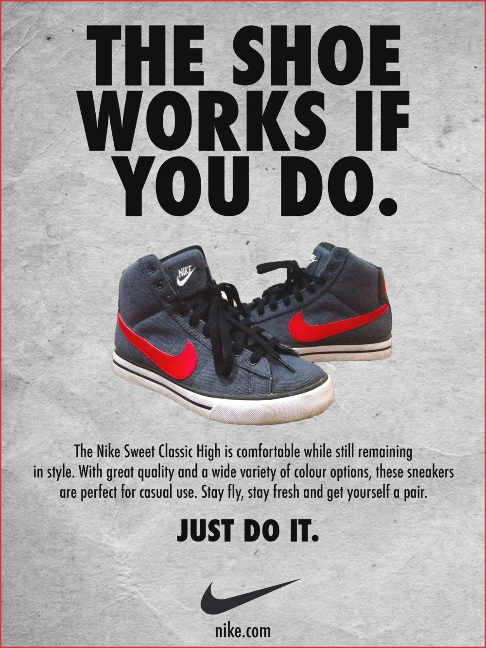
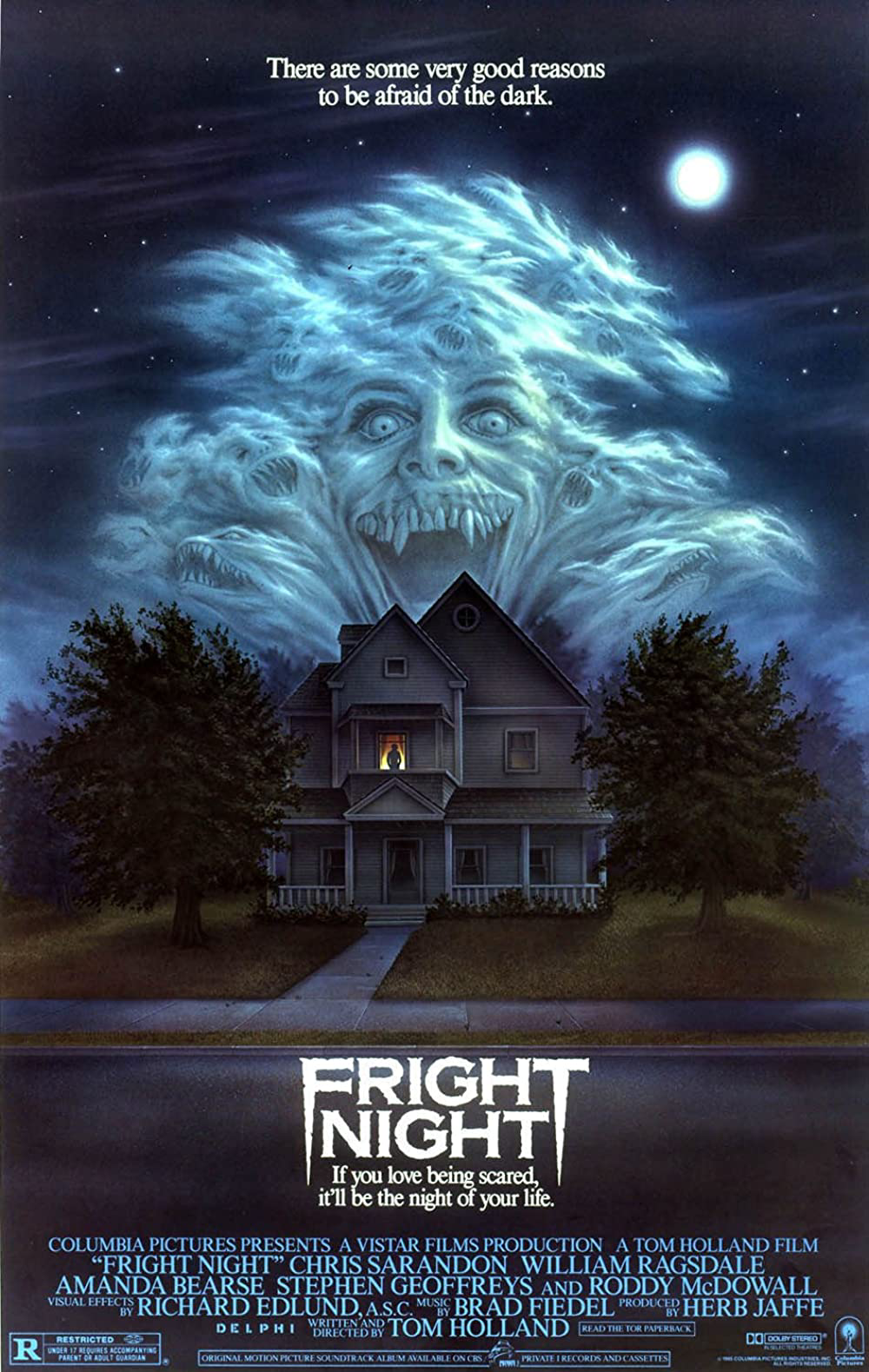
I used these posters as inspiration for my shoe ad I really liked the style of the text and how the shoes are in the centre of the poster. I really like how clean and organized they are. I really like how the poster on the left title isn't at the top centre of the poster, its more creative. On the poster on the right I like how big the text is in the title it really grabs your attention. The only thing I would change about poster on the right is the background and I would have put a shadow behind the shoes, it all blends together and it a bit boring. Both poster look fairly simple to create. For the one on the left all they did was create a blue vignette and added a white splatter in the middle then placed the pic of the shoe and added some shadows. Then they added the nike logo and text. For the poster on the right all they did was pick a background add the shoes, text and title, theres no special affects to it.
Shoe Print Practice Advertisement
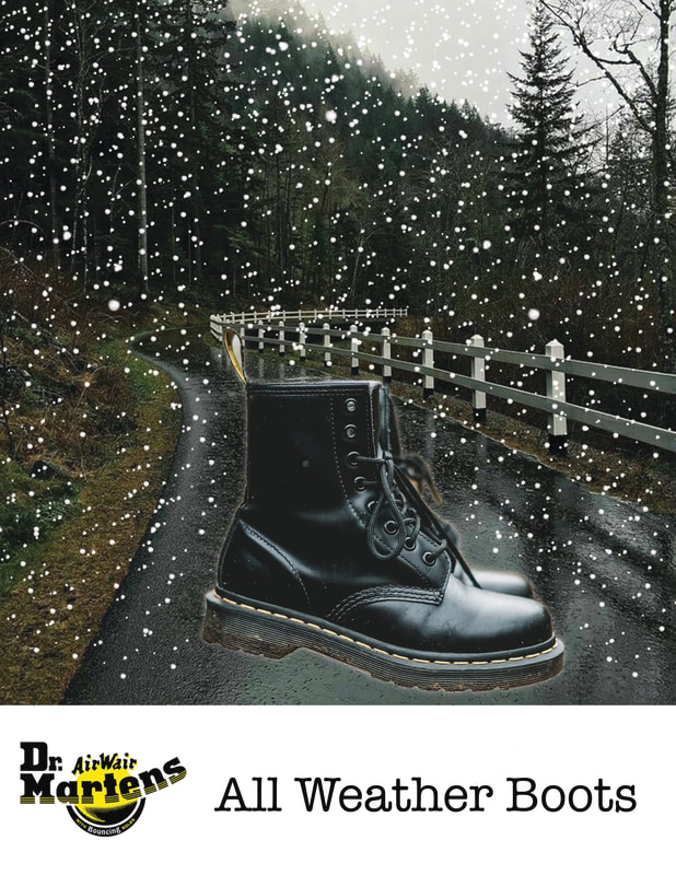
For this advertisement I decided to choose doc martins because I own a pair of these shoes and I really like them. I used a picture of them off pexels and got rid of the background. I also picked the background photo off pexels it was a wet rainy picture and I added the snow with a brush. I called them "All Weather Boots" because of the rainy background with the added snow but you can literally wear them all year round. I used shadows and added a glow effect behind the shoes to make them pop more. Then I added the Dr. Marten logo.
Shoe Print Advertisement
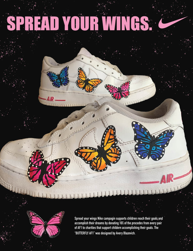
I decided to use this pair of shoes that I painted because I am really proud of my work and I thought it would look cool as a poster. I decided to use the slogan "spread your wings" as a nike ad to raise awareness for kids to follow their dreams and "spread their wings". To create this poster I removed the background from the picture of the shoe. Next I masked the shoes on a background and made it black. Then I used a splatter brush and made it pink to add some detail. I added the nike logo and slogan then added text at the bottom stating the concept of the add with the butterflies representing to "spread your wings".
|
|
Halloween Poster inspiration
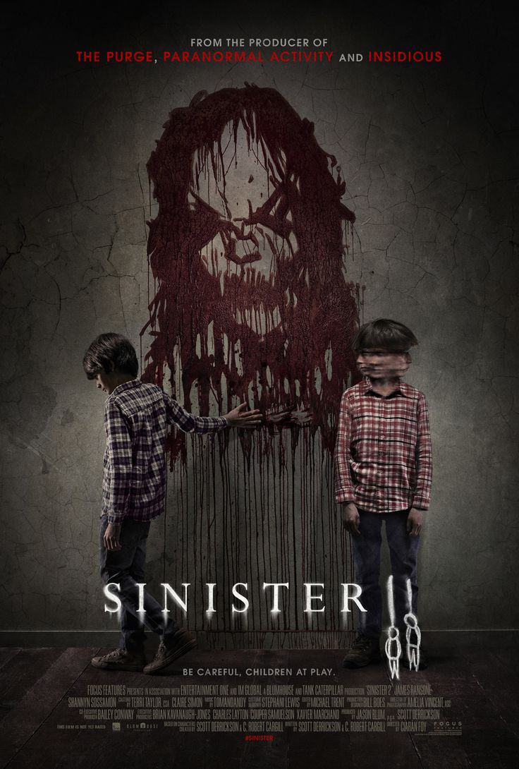
I really liked both of these posters they are spooky and scary, both get the message across. They helped me get ideas for my poster. I like how the sinister poster is dark and theres blood on the wall in the shape of a face. I made my poster dark and added blood splatters because I wanted my poster to resemble a similar message. The fright night poster I really like how its set up with the titles at the bottom and the scary text at the top and bottom, this gave me the idea to to add "beware the pumpkin murder" at the bottom.
Halloween Movie Poster
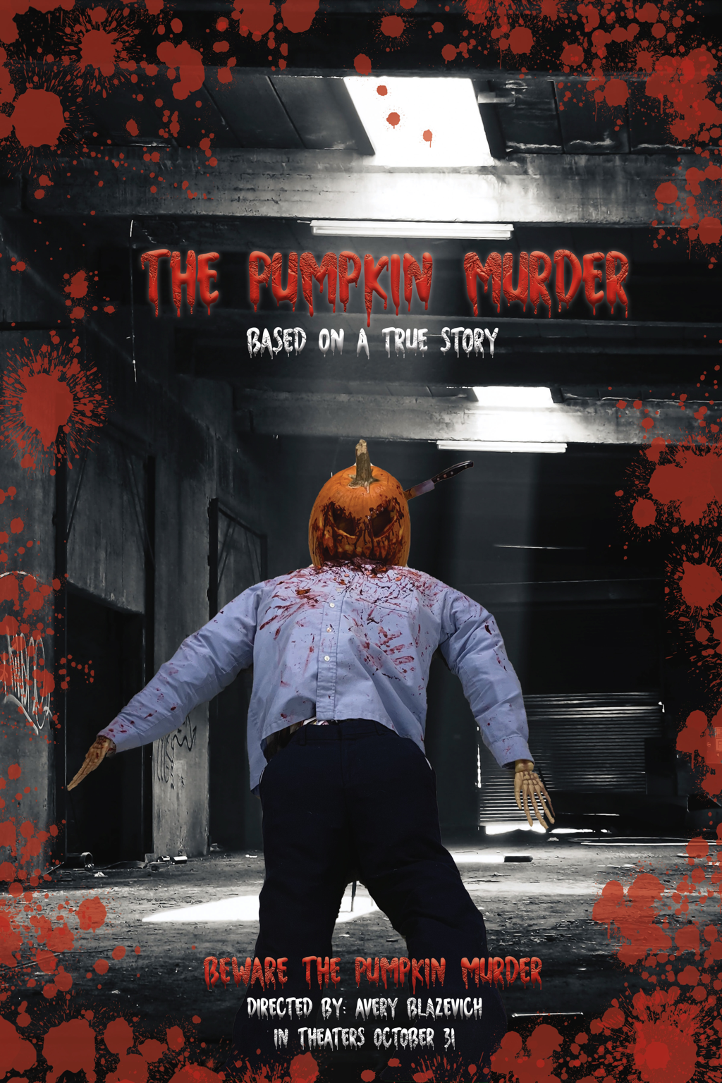
I really like how this poster turned out. I took a picture of the pumpkin man at school and got rid of the background. I found a cool but scary background on pexels and placed it on a layer. Next I added text and selected the glow feature behind the text to make it pop. Then I added texture to the text to make it look 3D and scary. Then I downloaded a blood splatter brush to make the poster gory, it makes sense because of the name of the movie name "The Pumpkin Murder".
